In an age when digital users are becoming less interested in everything what brands have to say, minimalist design may be the one that will help you business grow.
But, before we proceed, let’s see the main bullets of this article and what information will share with you. We’re going to go into:
- The aesthetic of minimalist design
- The UI benefits of minimalist design
- How can minimalist design stop users from developing tech burnout and how can it lead to a success.
Let’s get with aesthetic minimalist design.
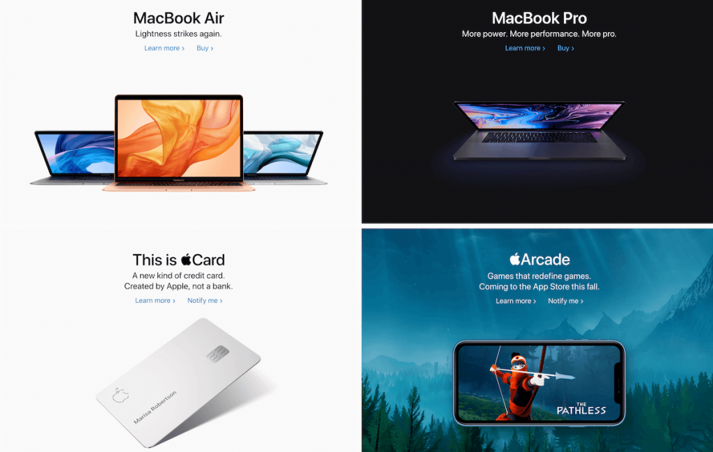
The Apple example is the one that stands out the most. When we think about minimalism, we automatically connect it with Apple’s identity. Their style is, for sure, minimal.
Let’s explore the elements that make a design minimalist.
The whites and blacks
Using white will help users focus on the main elements, not on the color or background. White doesn’t represent anything in design, that’s why you can use it to help your target understand the information easier.
White will also allow call to action buttons or other main elements to shine for maximum impact, while also creating a color contrast between them.
The business alternative is black. Its common sense is “seriousness”, but we can still use it for a minimalist design.

Typography
For a clean interface, Sans serif fonts are always a good idea. They look cleaner than serif fonts and are easier to read. Keep in mind, bigger business are using them to highlight their professionalism and their clean vision.
Colors
If you respect the whites and black, then bold colors should help you create that amazing contrast. Your focus should be on the visual information, which we consider the most important for your target.
 Source: https://medium.muz.li/
Emotion, meaning and power. Yet so simple
Minimal UI
Here’s what you need to consider while designing UI:
Clarity: Is the information clear enough?
Easy finding: How easy is for your target to find things?
Choosing: Is it easy for the user to make decisions?

Use only what’s important for your target
First rule of design: don’t use elements that are important only for a small part of your audience. This way you’ll avoid crowded design and an increasingly bounce rate for your website. Keep it simple.
Your mind won’t be focused on what you see if what you see is too much. And for sure, you won’t remind the identity of a brand.
Less options for a streamlined experience
The more options you give, the slower response time you’ll receive. Users don’t need too many options, it’s never easy to decide, they may suffer from decision paralysis, the inability to choose from your options, as a result of a digital abundance.
 Source: https://medium.muz.li/
The best example we have found is Atoms’ website. They reduces the number of options to the essential.
Preventing tech burnout
Digital appearance is now more sensitive than ever. Users are no willing to spend their time on websites that don’t fulfil their needs in less than 5 seconds. And we believe them. Everybody wants to sell, to be the best or to reach their audience. But only the ones who understand how it works may succeed.
As human beings, we can only handle a certain amount of information, and a small part of it goes to brands that we love.
And, the consequences of so many information that we barely see or don’t even reach are crucial.
It makes us feel burdened.
How will minimalist design help users?
Yes, we are able to reduce the stress, agitation and frustration users feel when scrolling websites.
Minimalist websites are a breath of fresh air in a digital world that constantly seeks attention. Be that happy place for any user that needs to feel a little protected.
Our virtual friends Inside Design Blog write one of the most outstanding articles about daily agency struggle. Read them out.
You can also read about new Instagram algorithms here.


